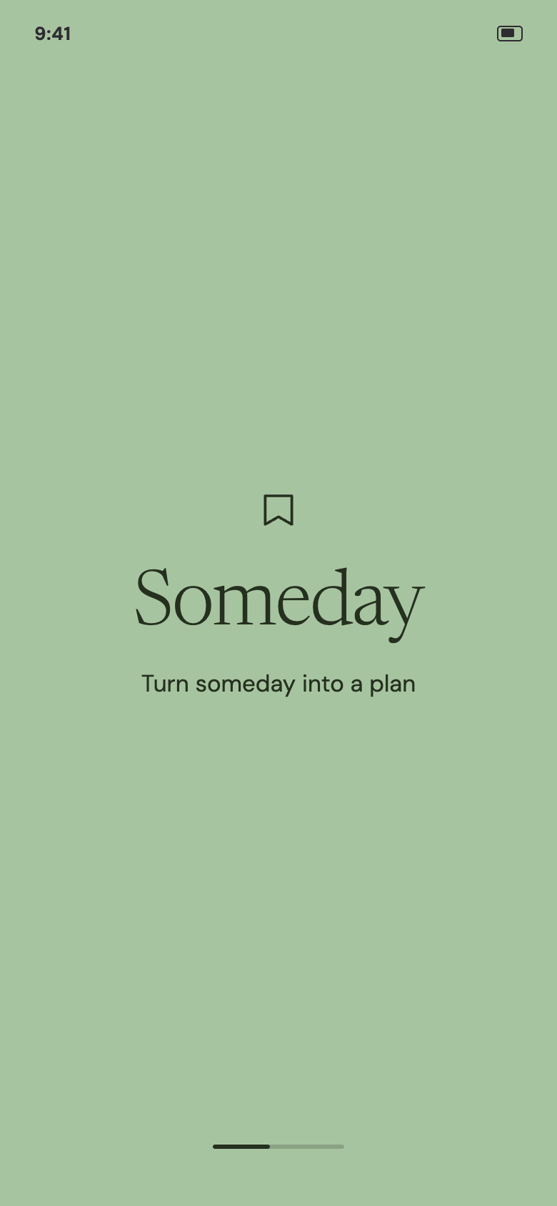
Someday
A concept for consolidating saved inspiration across TikTok, Instagram, and Pinterest into a single place — and helping people actually follow through on it, without relying on the guilt-driven notification tactics that make similar apps easy to abandon.
Final polished screen or wordmark treatment
People who consistently save inspiration across social platforms but rarely act on it — not due to lack of interest, but due to a mix of skill uncertainty, inconsistent structure needs, and past experiences with app notifications that made them disengage entirely.
Someday consolidates saved inspiration from TikTok, Instagram, and Pinterest into one place, then helps people actually act on it: due dates chosen per save, never required; opt-in AI help for ideas that feel too big to start; pull-first notifications instead of push-heavy nagging; and a triage flow that treats an old save as a decision to revisit, not a failure to fix.
I audited existing save-consolidation apps against the follow-through problem specifically — not just organization, which they already solve well.
Pull saves from TikTok, Instagram, and Pinterest into one place via a share extension, and solve organization well. None of them touch the psychological gap between saving and doing.
Goes one step further, turning travel saves into map-based trip plans — but only because travel inherently maps to an itinerary. A hairstyle, a recipe, or a hobby doesn't have that built-in structure, which is exactly the gap this project targets.
Solves the same consolidation problem, then adds the piece the others skip: optional due dates, opt-in AI planning for "unsure how to start" saves, and pull-first, triage-based accountability instead of guilt-driven push notifications.
I ran a focused teardown of how six existing products handle notifications — Pinterest, Duolingo, Urban Outfitters, Snapchat, Instagram/Messenger, and Headspace — looking at permission timing, channel behavior, settings reliability, and tone.
Guilt-driven copy and mascot tone, with no user control over notification volume. Users reported disabling notifications entirely because of how the app made them feel.
Recommendation notifications default to off. Reminder timing is fully user-chosen. Notifications are reframed as "sleep nudges" or "breathe nudges" rather than generic alerts.
Hobbyist — beginner knitter, home cook, into skincare/juice content. Saves inspiration casually via screenshots across TikTok and Instagram; organizes "when in the mood" rather than consistently.
- Act on saved ideas when she has real, uninterrupted time (a long weekend, an open afternoon)
- Try recipes and crafts she's genuinely curious about, without a rigid system getting in the way
- Keep her phone's notification footprint small and intentional
- Ambitious projects with unclear or missing instructions cause her to give up early
- Existing routines (like skipping workouts) are hard to break even when she's saved motivation for them
- Due dates and planners don't match how she actually operates — she acts immediately or not at all
- Screenshots content casually; rarely revisits saves methodically
- When she does revisit old saves, reacts with a mix of nostalgia ("cute") and cringe ("tacky")
- Keeps notifications on for only a small, consistent set of apps she actually uses
What she needs from Someday: due dates that are fully optional, never a barrier to a spontaneous save. Opt-in help on vague or advanced projects, so a missing pattern doesn't mean giving up entirely. Notifications that earn a place among her small, trusted set of active apps rather than adding to the noise.
Experienced organizer — heavy user of Pinterest boards and TikTok folders, keeps a physical planner/date book for personal goals and hobbies, not just work.
- Turn saved inspiration into scheduled, committed action the way her planner already does for other parts of her life
- Browse and collect broadly before committing to one project
- Keep her phone free of notification clutter while still tracking what matters to her personally
- Advanced patterns she's not yet skilled enough for stall out indefinitely (waited a full year for a creator to publish a pattern she wanted)
- General notification clutter on her home screen
- Guilt-driven app tactics — deleted Duolingo over its messaging
- Meticulous folder/board organizer across platforms
- Writes hobby projects and required materials directly into her planner's notes section — without that step, she says she wouldn't follow through
- Deletes saves she's outgrown, but treats categories differently (quick to delete fashion saves that no longer fit her taste; slower to delete food saves)
What she needs from Someday: due dates and structured planning as a real, easy-to-reach option — not buried or discouraged. The same opt-in AI help as anyone else for advanced projects she's not yet confident tackling. Full, granular control over notifications, defaulting toward minimal rather than asking her to opt out repeatedly.
Early low-fi sketches, flow exploration, and any paper/whiteboard process shots
Final polished screens across the core flow, built in Figma.
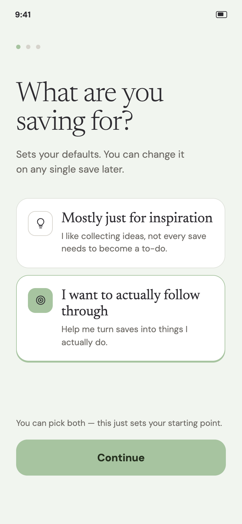
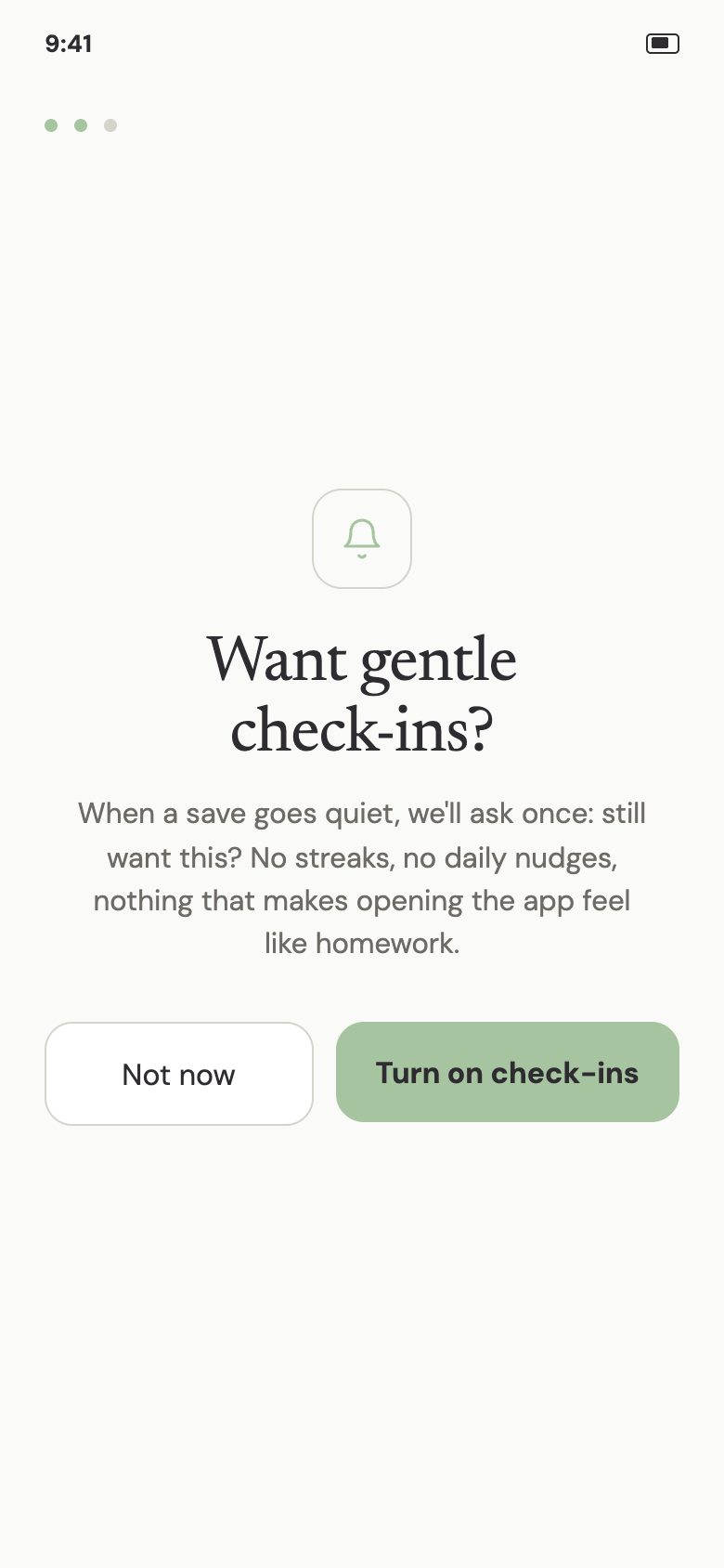
A soft permission ask before the system prompt. Since declining the OS notification dialog makes re-prompting difficult, a custom screen explains the value first and only leads into the system prompt if the user opts in. It only appears for users who said they want to actually follow through during onboarding.
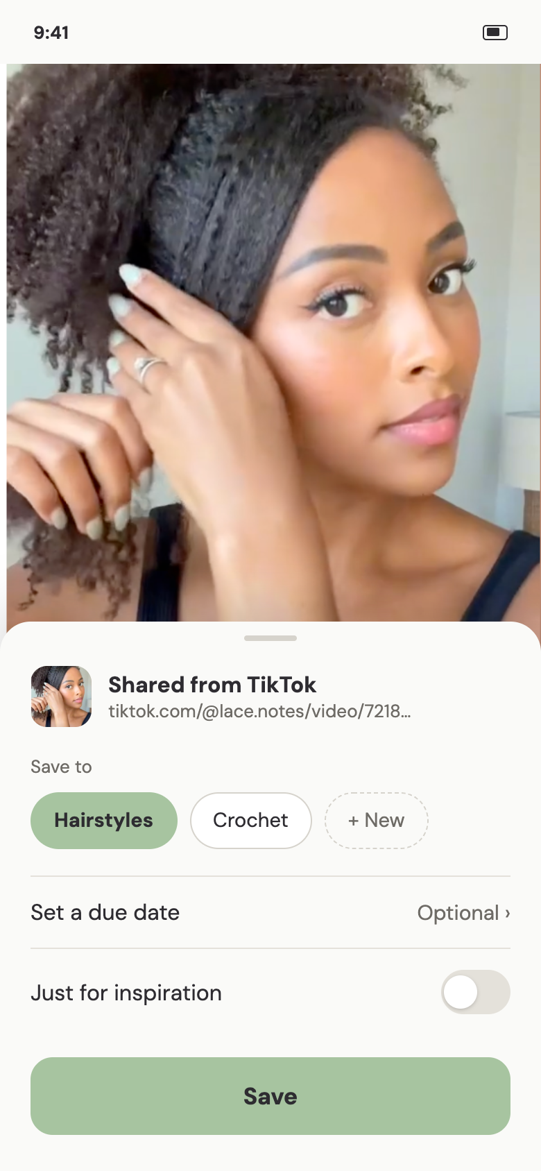
Due dates are optional, chosen per save — not a required step. Because participants split evenly on whether due dates help, forcing one at save time would alienate roughly half of them. The choice lives with the user, not a fixed app-wide setting.
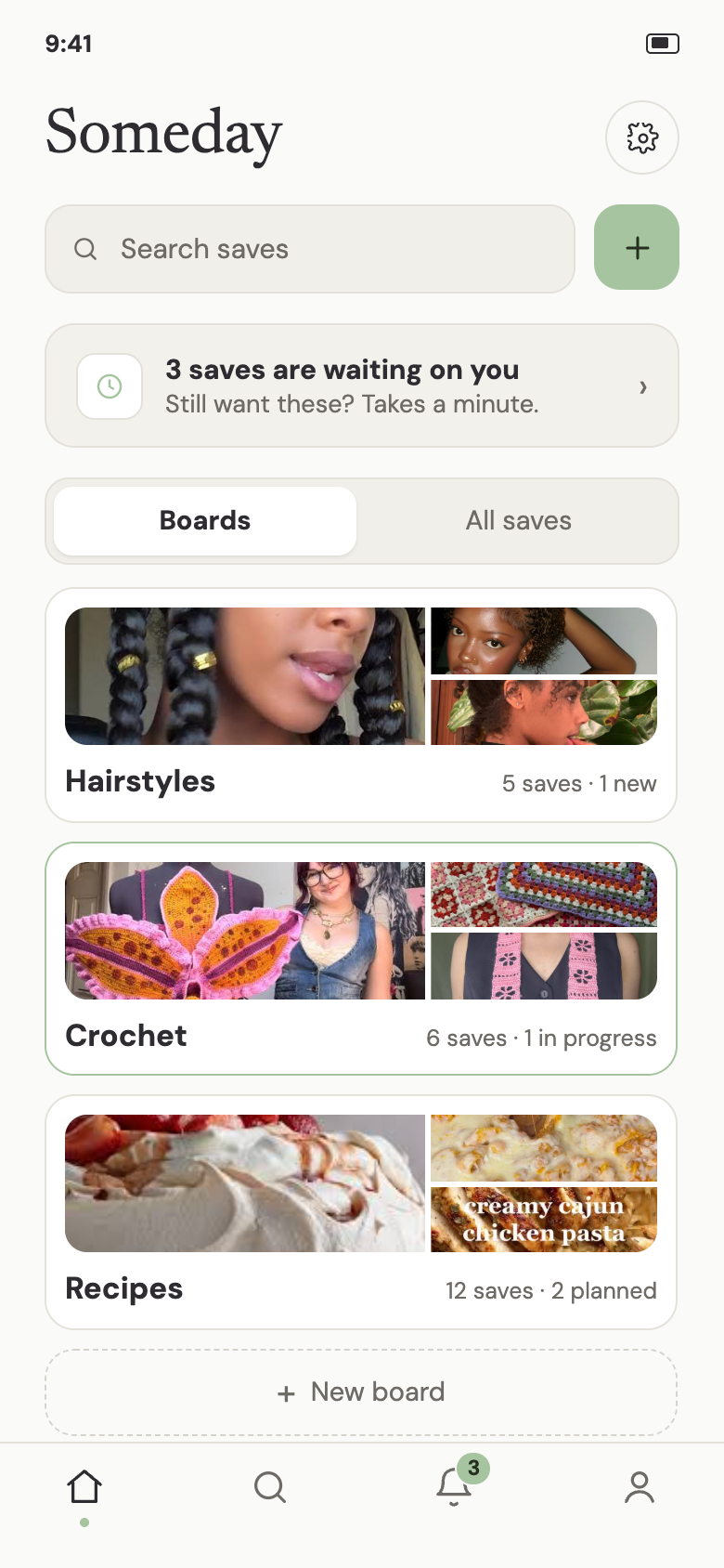
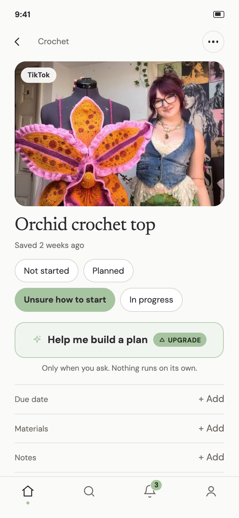
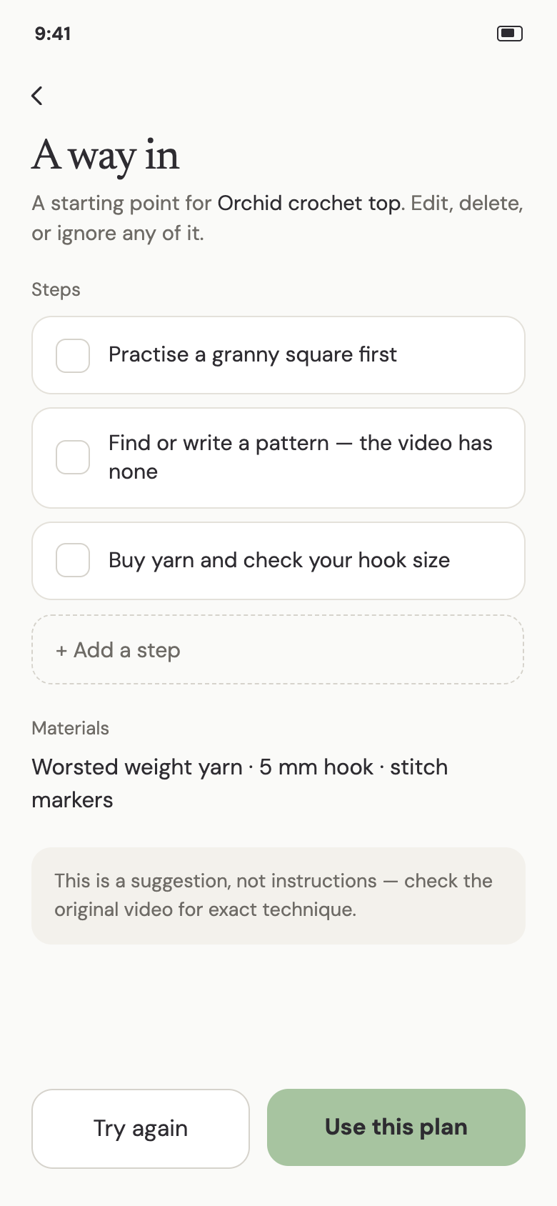
AI-assisted planning is opt-in, never automatic. When a saved idea sits in "unsure how to start," the app never generates a plan unprompted — it's a visible action the user taps ("Help me build a plan"). Every suggested step is editable and framed as a suggestion, and the screen discloses plainly when source material is incomplete.
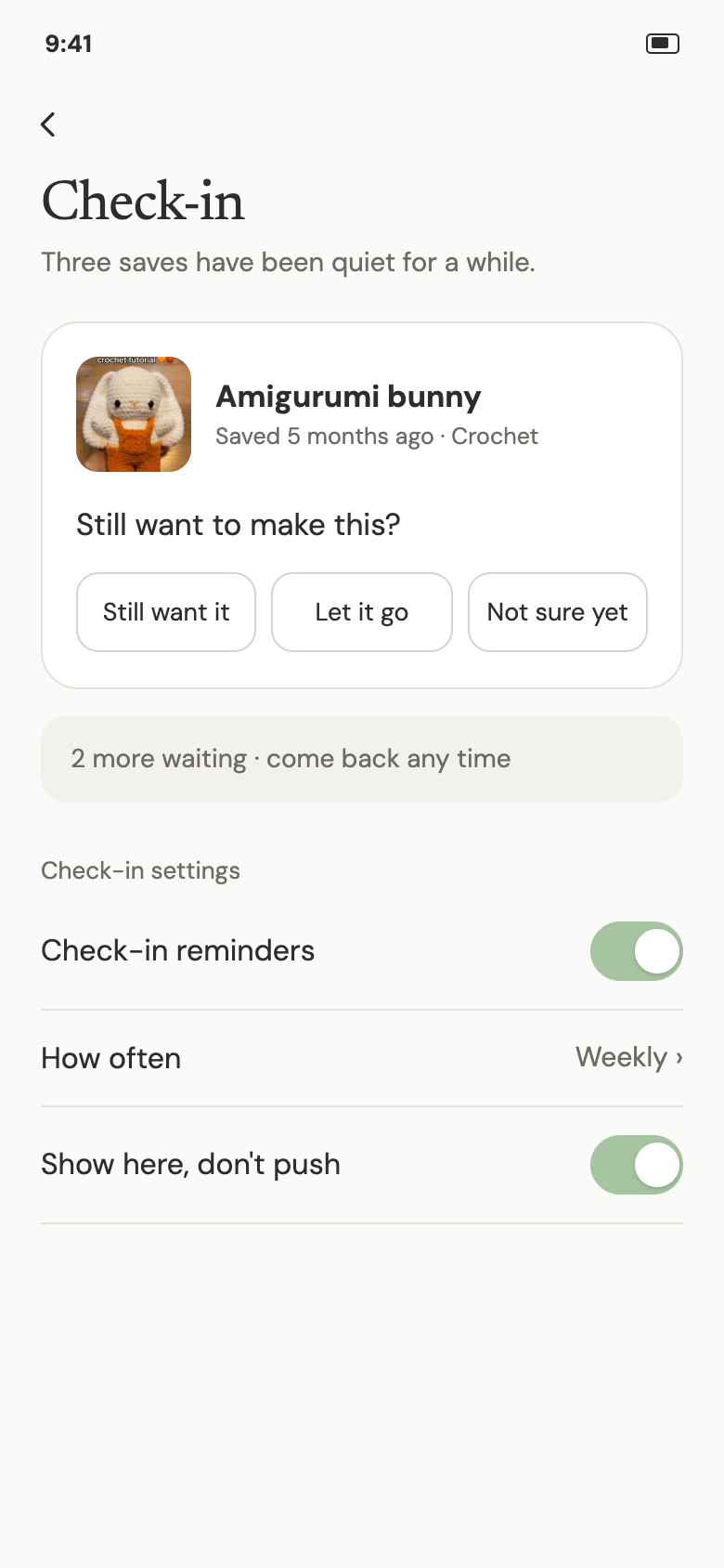
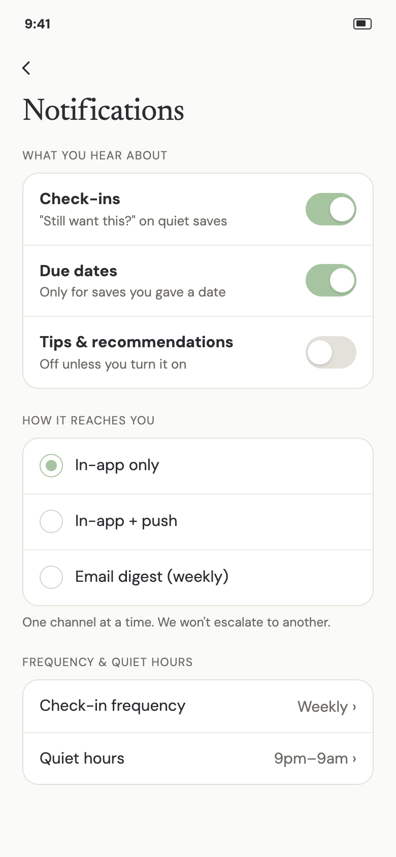
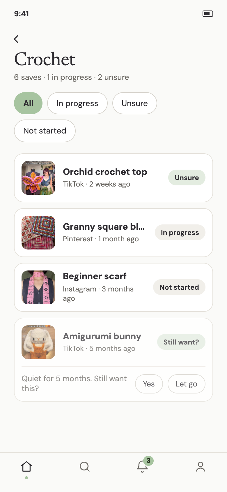
Triage, not tracking. Old, untouched saves resurface with a simple question — "still want this?" — with three honest outcomes: keep it, let it go, or defer the decision. Notifications are pull-first by default, with real user control: given the near-universal Duolingo backlash in interviews, the default experience favors in-app check-ins over push. Where push exists, it's a single either/or choice with in-app — not stacked with email — and recommendation-style notifications default to off.
The road not taken — alternatives explored before arriving at the final direction.
A pull-first model almost certainly means lower day-to-day engagement than a push-heavy competitor — that's the point, but it's a real cost if this were a product with growth targets. I'm accepting lower engagement as the price of not becoming Duolingo.
Making due dates optional protects the half of my sample who found them pressuring — but the other half get a weaker default experience unless they opt in. A different designer could reasonably bet the other way.
Requiring a tap rather than surfacing help automatically means some people who'd benefit most — stuck and unsure — might never discover it.
Restricting push and email to an either/or choice reduces the odds any single reminder reaches the user — the trade-off for solving the channel-crowding complaint from research.
Three of four interview participants shared a craft/hobbyist context, which shaped flows like "unsure how to start" in ways that may not generalize. I'm treating this as a real limitation, not a settled finding.
The core flow runs onboarding → soft permission moment → share-extension save → home confirmation → board detail → task detail → AI-assisted plan-building (opt-in) → triage → notification settings.
Flow diagram — the full user journey, onboarding through triage/settings
Hypothesis:
What I'd measure:
- Saved-task completion rate — the percentage of saves that move to "in progress" or "completed" within a given window. The core metric: it tests whether the accountability model works at all.
- Notification opt-out rate — the percentage of users who disable check-ins entirely after enabling them.
- Time-to-first-action after a triage session — how quickly a user acts after a check-in prompt, versus how often stale saves are simply ignored again.
- "Let go" rate vs. silent abandonment — how often users actively release a save compared to how often saves just sit untouched indefinitely.
- A/B comparison against a push-reminder control group — completion rate and opt-out rate for a pull-first cohort against a push-reminder cohort, holding everything else constant.
What would prove this wrong: if the pull-first cohort showed lower completion than the push cohort, that would suggest some users need to be pushed toward action more than this design assumes — mapping back to the due-date and notification-preference split already found in interviews.
This is a concept, not a shipped product, so what follows is the plan for moderated usability testing rather than completed findings — to run once there's a testable prototype, with a participant mix broader than the hobbyist-skewed interview round above.
What I'd test:
- Save an item via the share extension and file it into a board.
- Locate a specific saved item and change its state.
- Use "unsure how to start" to generate and edit an AI-assisted plan — watching whether it feels trustworthy, generic, or off-base.
- Go through a triage/check-in prompt — watching whether "still want this?" feels supportive or still reads as pressure.
- Adjust notification settings (type, delivery channel, quiet hours).
Usability findings — to be filled in after sessions run
The most useful shift in this project happened when the research disagreed with my starting assumption — I expected due dates to universally help, and half my participants told me otherwise. Building the due-date decision around that disagreement, instead of picking a side, produced a better design than either extreme would have.